ARTICLE
Market Recap + Outlook | Second Quarter 2021
by: Smith and Howard Wealth Management
An In-Depth Look at the Markets Through Mid-Year
Continued momentum on the economic front proved more than enough to overcome inflation headwinds as stocks, bonds, and real assets/commodities pushed higher during the second quarter. With growth driven primarily by strong returns in stocks, investors have now enjoyed five consecutive quarters of positive returns. The world may still be dealing with aspects and even new variants of the coronavirus, but that does not appear to be denting optimism in financial markets. In fact, the depths of the pandemic-driven market selloff are more than 15 months old and increasingly feel like a distant memory.
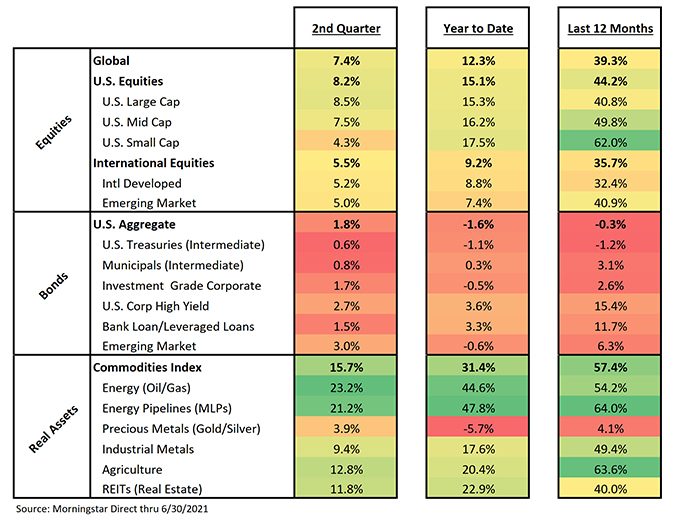
As done in previous CFO Reports, we have included our market returns “heat map” to aid in the discussion around market returns. We’ve found it helpful (and hope you agree) in understanding and following where returns are being generated and what trends may be impacting portfolios and investors. We were particularly struck by the pattern, or the consistency of the pattern, exhibited this past quarter relative to a six and 12-month timeframe.
Real asset returns, with the exception of Precious Metals, have generally had the most impressive returns across all three timeframes shown above. It is worth pointing out, however, that this is partially a function of the time periods chosen for the table. Real assets were slower to recover in the spring of 2020, so the picture would look very different if we showed the last 15 months rather than the last 12. Equity market returns may not be as “green” as most of the real assets, but there is no denying how strong returns have been over the three periods shown. Unlike with real assets, this story would actually be even more impressive if we used a lookback window of 15 months. Bond returns were positive during the second quarter, but as the table shows, they remain lower year-to-date and have generally trailed real assets and equities even when returns have been positive.
Equities
Recap – Equity returns were meaningfully positive across market segments, but there was a noticeable shift in two trends during the recent quarter. Smaller-cap stocks trailed larger-cap stocks in the U.S. and growth stocks generally outpaced value stocks – a notable change compared to what investors have experienced since early last fall. It is worth pointing out, however, that both small-cap stocks and value stocks remain ahead for the full year-to-date period.
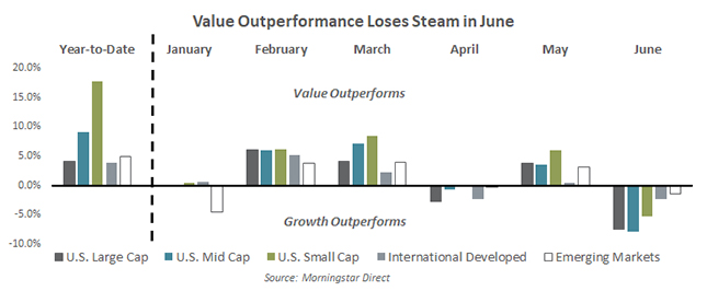
As shown in the graph above, the shift in the value vs. growth dynamic was most pronounced in June. The data in the chart highlights the difference in return between value stocks and growth stocks for the year-to-date period, but also by a monthly breakdown. For example, in June, U.S. large-cap value stocks returned -1.1% compared to U.S. large-cap growth stocks which returned +6.3%. The differential was 7.4% in favor of U.S. large-cap growth stocks which appears in the grey shaded column under the June grouping. After some back and forth in April and May, June was a strong month for growth stocks across the board.
So, what happened in June? As we’ll show in the following graph, the shift actually began in mid-May for most segments and appears to have been driven by a change in inflation expectations.

Inflation concerns have been a driving force for financial markets throughout 2021. As the graph attempts to show, investor expectations for inflation have moved steadily higher for most of that period. Inflation expectations are represented by the shaded yellow area and the % scale on the right. The yellow shaded area appears to peak in early to mid May and appears to closely align with the peak of value outperformance across various market segments.
Again, value stocks remain ahead of growth stocks for the year-to-date period. One month certainly isn’t proof of a sustained shift, but it’s a dynamic worth watching. As we’ll note in the outlook portion of this discussion, we continue to believe that value, along with smaller-cap and international stocks, represent more attractive valuation-based opportunities for investors. Although as displayed above, it’s not just valuations that drive returns, at least in the short term.
Outlook – it depends on your viewpoint
As equity markets have continued their impressive climb, it should come as no surprise that they have become increasingly expensive. While they are certainly more expensive today than they were a few months or even a year ago, how expensive they are now is debatable depending on one’s perspective or how they choose to view it.
As discussed in prior writeups, we like to look at equity valuations in two ways: on their own merits and compared to other investment opportunities like bonds. These two valuation approaches don’t always lead to the same conclusions. That is very much the case today.
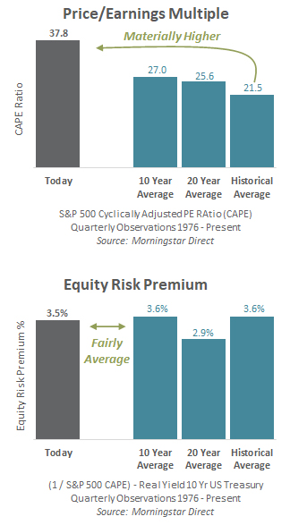
Let’s look first at stocks on their own merits. In the chart on the right, we are showing the Price/Earnings multiple for the S&P 500 today versus several different historical averages. The higher the multiple, the more an investor is willing to pay for each dollar of earnings the market is producing. In other words, the higher the multiple, the more expensive something is. There isn’t as much debate on this measure, as the 37.8x is clearly and materially higher compared to any of the averages we’ve listed. The one positive investors can reference is that the current reading is still below the record 44.2x level it reached during the tech bubble. That is likely of little comfort, however, given what happened when the tech bubble burst.
The story and analysis changes quite a bit when we broaden the lens to include the impact that interest rates and bond yields have on what investors are willing to pay for stocks. In earlier communications, we’ve discussed the concept of the Equity Risk Premium (ERP) and the role it plays in judging the attractiveness of stocks compared to bonds. Stocks, or equities, should be expected to earn a “premium” over bonds, given that investors are taking on more uncertainty or risk. Our analysis, and the accompanying graph, compares what that current premium is to what it has been historically. In this construct, the higher the equity risk premium percent, the more attractive stocks are relative to bonds. While we wouldn’t argue that the S&P 500 is “cheap” based on the Equity Risk Premium, today it does appear at least fair compared to historical averages.
While asset managers and investors often gravitate toward or emphasize one valuation approach over the other, we believe both provide valuable information. It is impossible to know what will drive markets in the short term, but the disconnect in the two measures today is being driven by the historically low level of global interest rates. Obviously, if low rates can drive up stock market valuations and prices, then it is logical that higher rates will have the opposite impact.
As we’ve consistently pointed out over the last few years, broad measures of market valuations that focus solely on the U.S. large-cap market (like the S&P 500) may not show all the pockets of opportunity that exist. We believe that investors willing to shift their allocations towards value, smaller capitalization, and international stocks are likely to fare better in the long run as those areas continue to have more attractive valuations both compared to their own history and relative to bonds.
Bonds
Recap – After experiencing its worst quarterly drop in nearly 40 years during the 1st quarter, the Bloomberg Barclays Aggregate U.S. Bond Index recovered nearly half of that loss during the second quarter. The index gained +1.8% during the most recent quarter, but remains down -1.6% year-to-date. The gains were largely the result of abating inflation expectations. As we showed earlier in our commentary in relation to the value vs. growth dynamic, inflation expectations peaked in early May and began to fall as the quarter closed.
As consumers are keenly aware, inflation itself appears to be picking up, not dropping. So, why the disconnect between expectations and current inflation trends? There are two primary reasons. The first is that inflation expectations picked up before inflation itself did. In other words, financial markets anticipated some of the move higher in inflation that we are now experiencing. The second is that most economists continue to believe that the move higher in inflation data is likely temporary. We discussed this in more detail in our On the Horizon video segment this quarter.
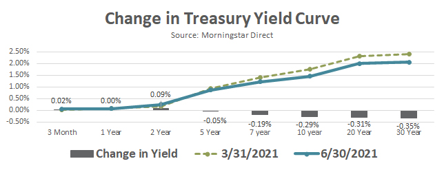
While the moves this quarter in interest rates and the yield curve weren’t particularly large, they were enough to produce positive results for bonds. As our Change in Treasury Yield Curve graph shows, the drop in yields was more pronounced the further one goes out the curve (longer maturities).
Non-investment grade fixed income, which is not part of the broad Bloomberg Barclays Aggregate U.S. Bond Index, also enjoyed a strong quarter. U.S. Corporate High Yield (+2.7%), Bank Loans (+1.5%) and Emerging Market Debt (+3.0%) all benefitted from the overall drop in yields.
Outlook – Since bond prices and yields move in opposite directions, the lower bond yields compared to the last quarter end effectively dampen future return expectations. As illustrated in the Change in Treasury Yield Curve graph, there was little movement in short term rates, but a more meaningful move lower for maturities further down the maturity curve. On a historical basis, investment grade bonds remain expensive with lackluster yields.
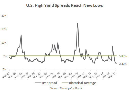
The non-investment grade credit portion of the market, an area we typically refer to as Opportunistic Fixed Income, is one in which we remain active. After using the pandemic related selloff to add to this exposure in April of 2020, we have used the impressive recovery in this portion of the market to slowly but steadily take profits and reduce our exposure. We began this process last fall as yields returned to below average levels and further reduced our exposure again this quarter as the additional yield an investor could expect from buying high yield bonds versus investment grade bonds reached a historic low (shown in the accompanying graph). While non-investment grade credits still offer an opportunity to pick up additional yield versus investment grade credits, we don’t believe that shrinking additional yield adequately compensates investors for the higher risk embedded in those bonds.
Real Assets
Recap – As our market “heat map” illustrated, real assets, consisting primarily of commodities and commodity related stocks, have experienced the strongest percentage returns over the last 12 months. However, part of this is because commodities broadly bottomed after stocks and credit sensitive bonds and at much lower levels. As impressive as the three, six, and 12 month returns may appear, the following exhibit shows that commodities broadly are just now returning to flat since the beginning of 2020 (dark grey line).
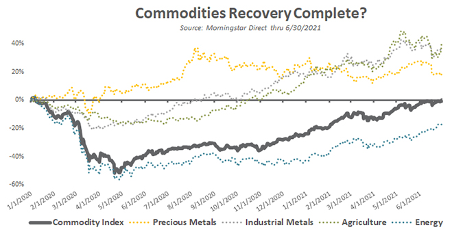
The graph also shows there is quite a bit of dispersion when it comes to the returns of different segments of the commodities markets. Precious metals, consisting primarily of gold and silver, never really sold off and actually peaked a little less than a year ago. Industrial metals and agriculture suffered during the pandemic, but recovered fairly quickly and are well above breakeven. The real laggard, which has kept the broader commodities index from getting back to even earlier, is energy. Many will recall that oil prices (a primary component of the energy index) actually went negative for a short period of time during the pandemic. Unfortunately, anyone who has gone to the gas pump recently knows that is no longer the case!
Outlook – At Smith and Howard Wealth Management, we don’t typically invest directly in commodities. Commodities themselves do not pay interest or produce a cash flow, making them difficult to value or invest in directly. We will, however, invest in commodity-related businesses and allow our managers the flexibility to invest in such areas. One area in which we have allocated capital in the past and retain a stake in today is Energy Pipelines (often referred to as MLPs). Despite their surge higher the last few quarters, we continue to believe they represent one of the more compelling valuation opportunities in today’s market.
Our video segment, On The Horizon, highlights changes in inflation and tax policy. To read our second quarter market summary click here.
As always, each advisor at Smith and Howard Wealth Management is available and eager to answer your questions on these or other topics related to investments and financial planning. Please call us at 404-874-6244 or email us here.
Unless stated otherwise, any estimates or projections (including performance and risk) given in this presentation are intended to be forward-looking statements. Such estimates are subject to actual known and unknown risks, uncertainties, and other factors that could cause actual results to differ materially from those projected. The securities described within this presentation do not represent all of the securities purchased, sold or recommended for client accounts. The reader should not assume that an investment in such securities was or will be profitable. Past performance does not indicate future results.

Subscribe to our newsletter to get inside access to timely news, trends and insights from Smith and Howard Wealth Management.
 Back to Insights